How a rebranding inspires a design system
Jigsaw is a unit within Google that explores threats to open societies, and builds technology that inspires scalable solutions hence trying to make people safer from digital conflicts.
Opportunity
Why focus on a dedicated design system:
Jigsaw Rebranding
Jigsaw recently underwent a rebranding exercise to better tell its story of shaping technology to make people around the world safer. This gave the product team to explore a distinct design language that was inline with the branding.
Non-Google Branded
Being an open-sourced project with various ongoing partnerships, Jigsaw products needed to be distinct from Google branded produts for business distinction purposes.
User Experience
Consistent interactions across touchpoints can help with usability, trust, recognition, and satisfaction.
︎
Along with a brand alignment, a dedicated design system brings the opportunity to deliver high quality, distinct, and consistent experiences to Jigsaw users.
Project
Create a design system that can promote visual consistency, workflow efficiency and crossfunctional confidence enabling PMs and engineers to better make implementation decisions.
Design Foundations
Define UX design principles and styles that can guide asset generation
Components and Patterns Library
Create a shared library of stadardized components and patterns for different product verticals and acclimatize product and engineering teams with Figma.
Role
UI/UX Design along with Tara Hosseinipour and Monique Smith from Jigsaw UXD
UX design principles
︎
Empower users to combat online threats
Provide a safe space and empower at-risk users to define their own experience by giving them control to take action. Every element and interaction in our designs should have a clear purpose, understand our user’s needs, and enable them to achieve their goals specific to their context.
︎
Build trust through transperency
Spearhead innovative problem solving for emerging problems while acknowledging the experimental nature of our work. Help users calibrate their trust by demystifying our technology and being honest about limitations. Don’t overwhelm users with information but ensure that they feel safe in using our products.
︎
Be cold and distinct
Create experiences that are intentionally unique and visually stand out as the Jigsaw branded. Leverage Google patterns as a foundation of our design system to keep users focused, but build upon it to make stand out products. Leverage animations or other UI moments to create a Jigsaw personality.
Styles
Foundations of the design library considering legibility, accessibility, and branding.
︎
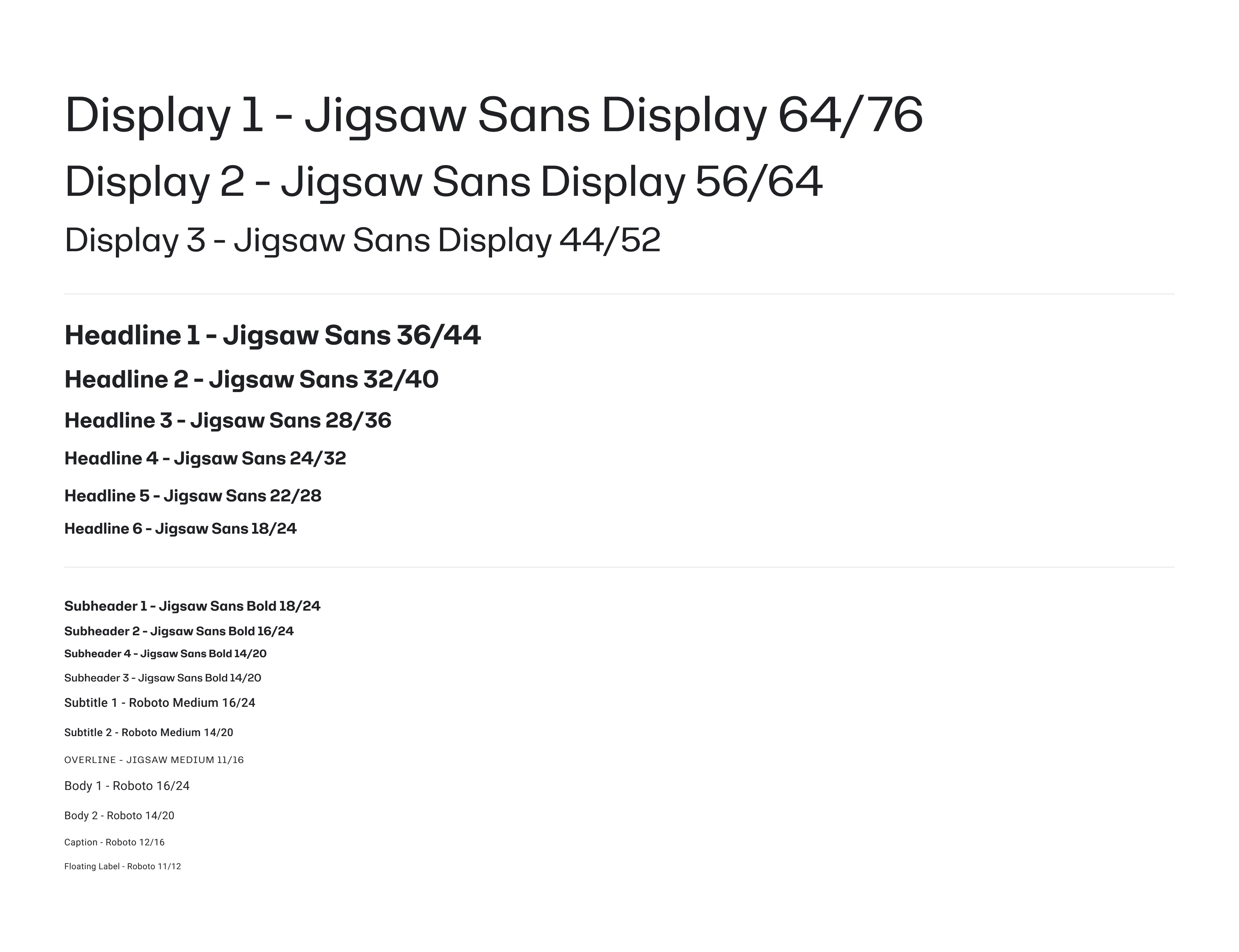
Typography
Typography
Jigsaw Sans and Roboto to balance distinct branding with legibility, content density, information hierarchy, and accessibility.
︎
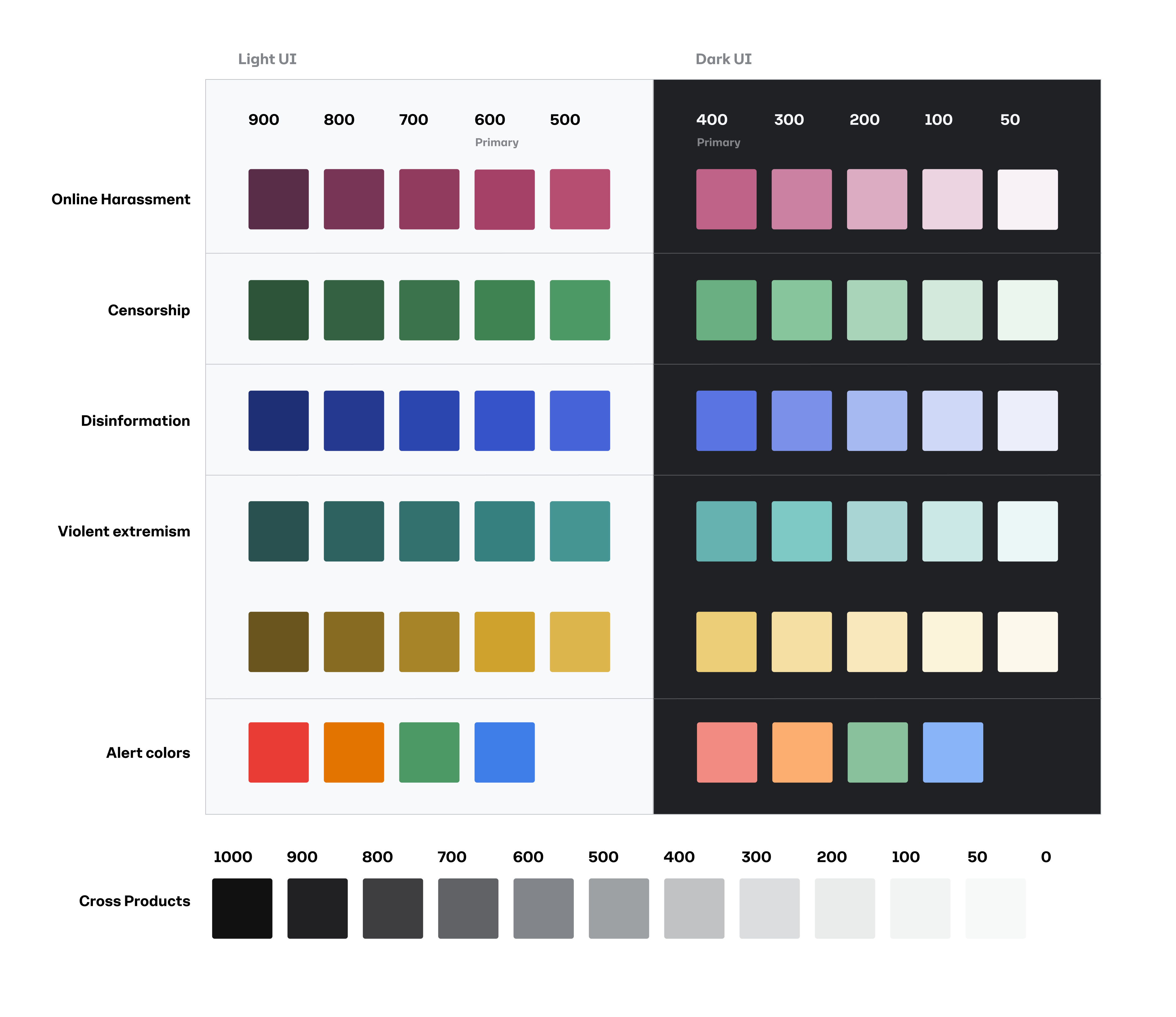
Color Strategy
Color Strategy
Jigsaw’s branding strategy relies heavily on an overall monochromatic aesthetic with specific colors assigned to each product/provblem space. For the product design system these product colors were fleshed out further to create scalable colors for dark and light UI while improving usability with accessible contrast ratios.
︎
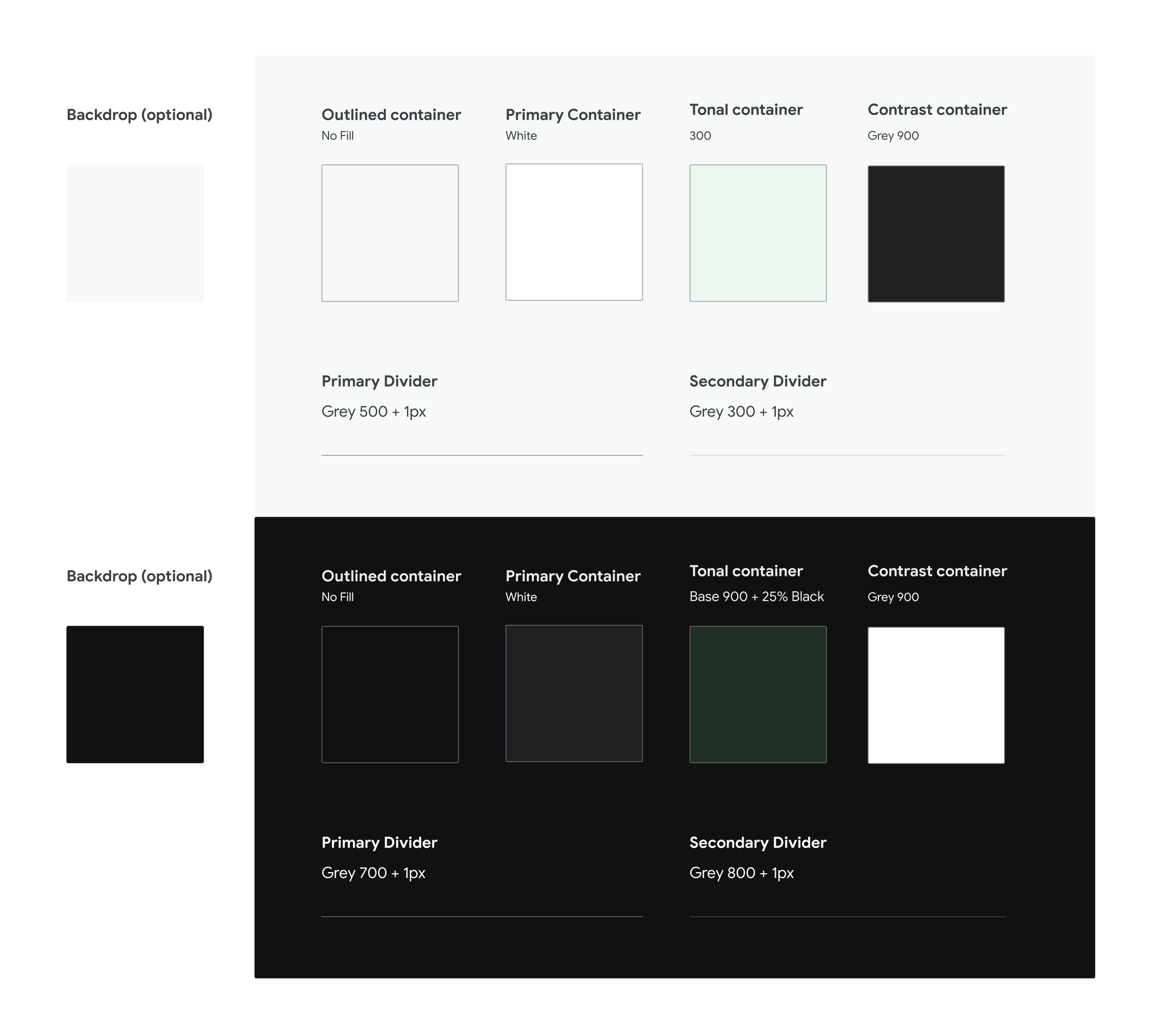
Surfaces
Surfaces
Jigsaw’s branding strategy relies heavily on an overall monochromatic aesthetic with specific colors assigned to each product/provblem space. For the product design system these product colors were fleshed out further to create scalable colors for dark and light UI while improving usability with accessible contrast ratios.